All projects

$ open project/black-bull-mobile

BLACK BULL

A Connected Restaurant Ordering Experience

NFC access, a visual digital menu and clear order confirmation—connecting the guest experience with the kitchen and table service.

  • Next.js
  • TypeScript
  • React
  • Figma
Explore the case study MVP in development
PRODUCT WALKTHROUGH · NFC → MENU → KITCHEN → TABLE 01:15 · EN
Role
Product Design & Front-end Development
Type
Digital menu + kitchen display
Status
MVP in development
Focus
Mobile UX · Restaurant operations

01 / PRODUCT STRATEGY

One restaurant. Two sides of the experience.

Black Bull brings the customer-facing menu and the kitchen workflow into the same product story. The design balances a strong steakhouse identity with the practical details of ordering and preparing food.

THE DESIGN CHALLENGE

A digital menu needs to be easy to browse on a small screen. At the other end of the journey, kitchen staff need to identify the table, read the items and understand the order status at a glance. Both experiences need clarity, but their priorities are different.

THE PRODUCT APPROACH

Use photography and familiar categories to guide guests through the menu. Make the confirmation screen explicit about what happened. Give the kitchen focused order cards and visible preparation states, keeping the Black Bull identity consistent throughout.

For guests

Recognizable categories, visual browsing and a clear confirmation.

For the restaurant team

Table context, readable order details and visible preparation stages.

02 / THE GUEST JOURNEY

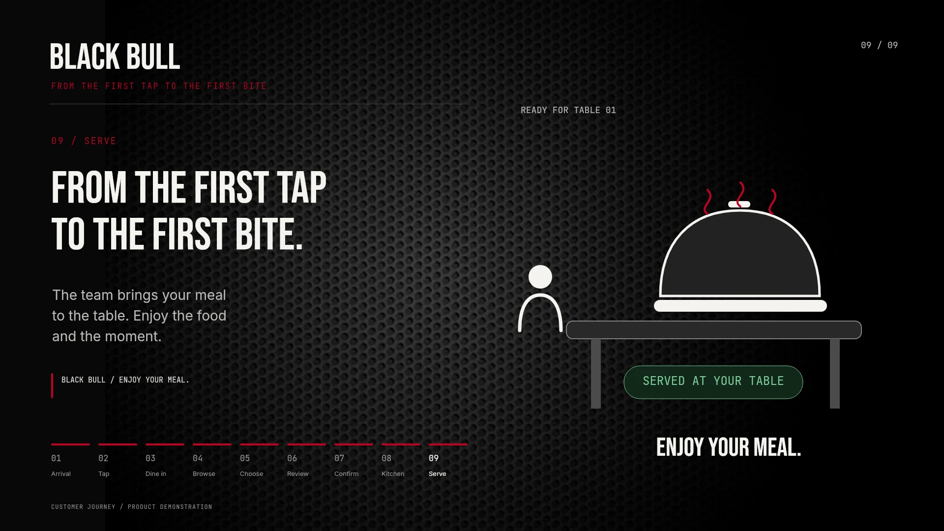
From the first tap to the first bite.

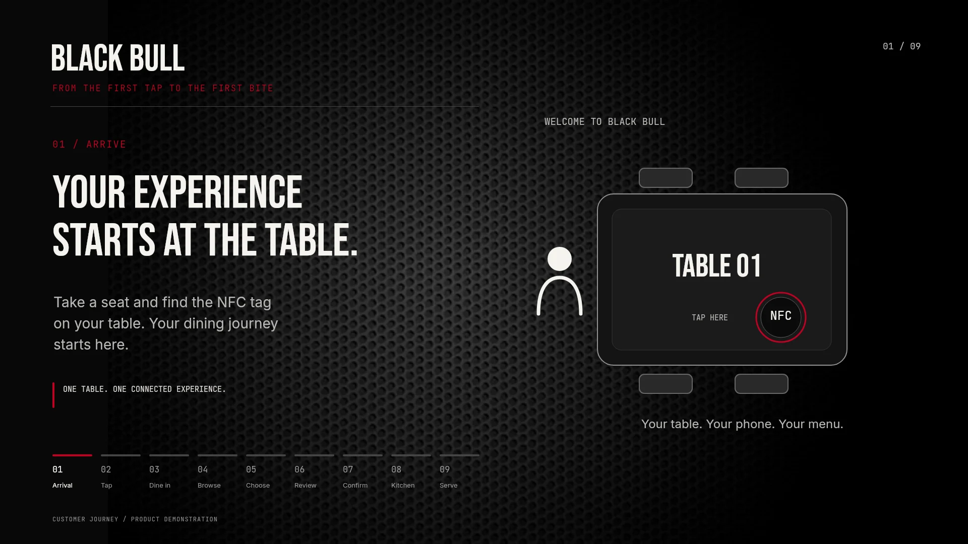
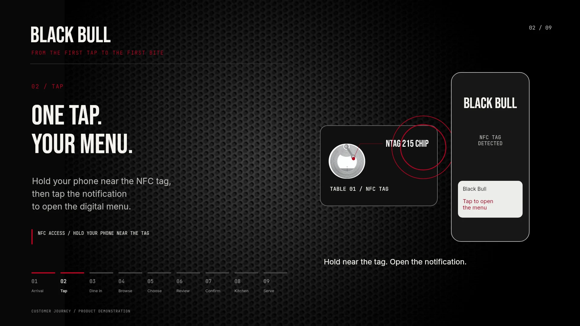
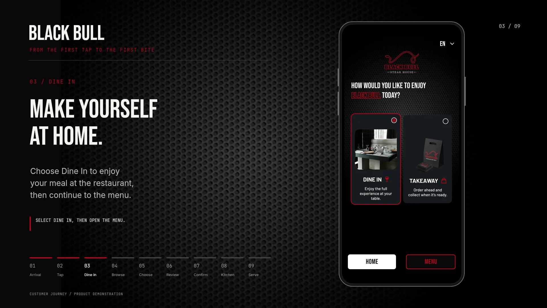
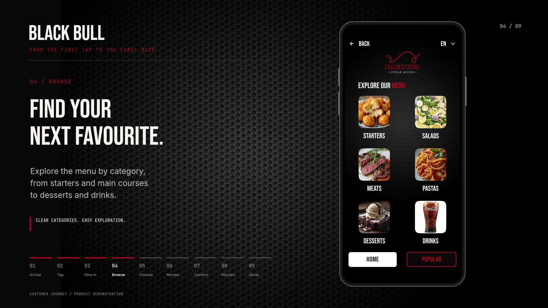
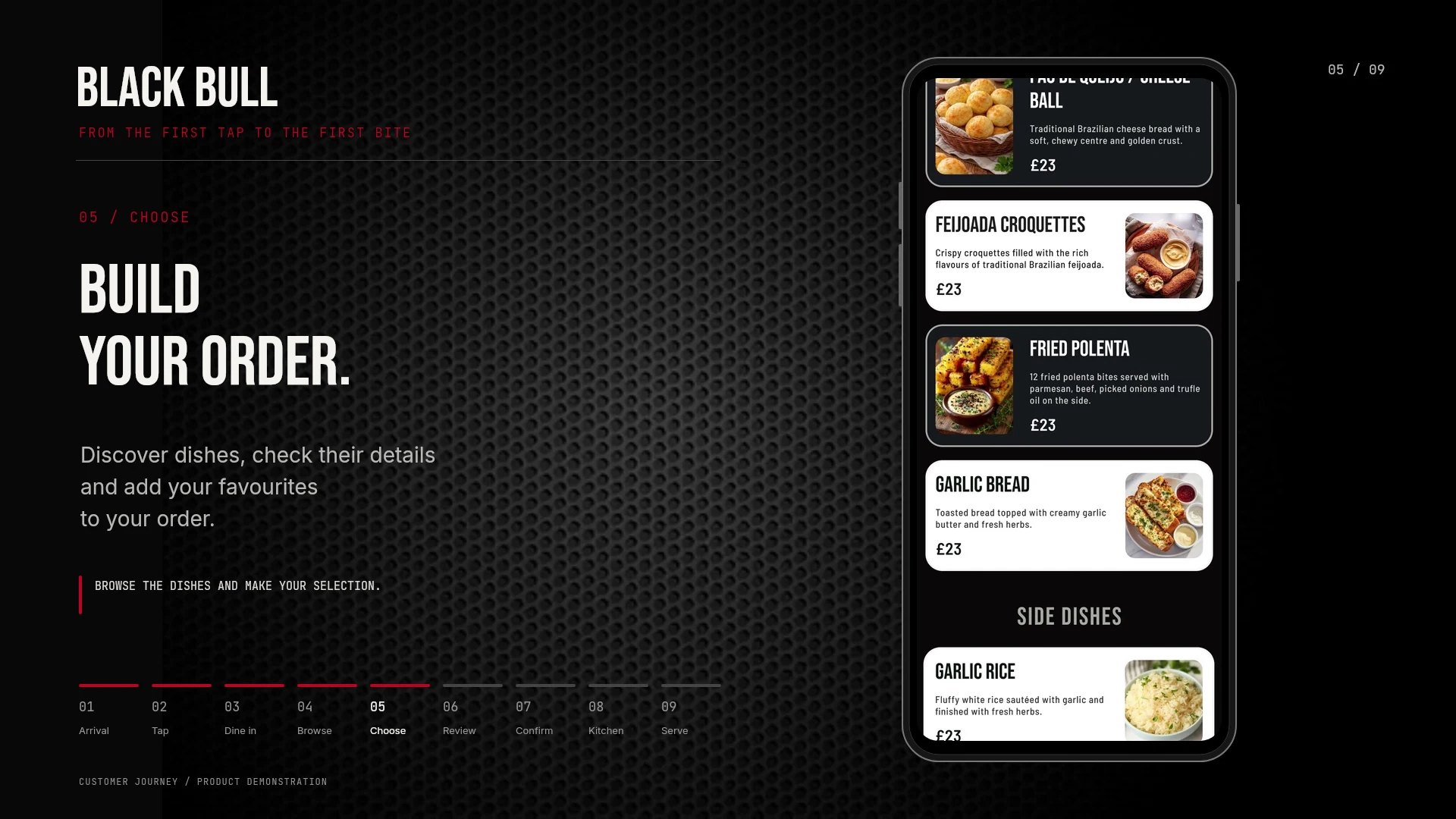
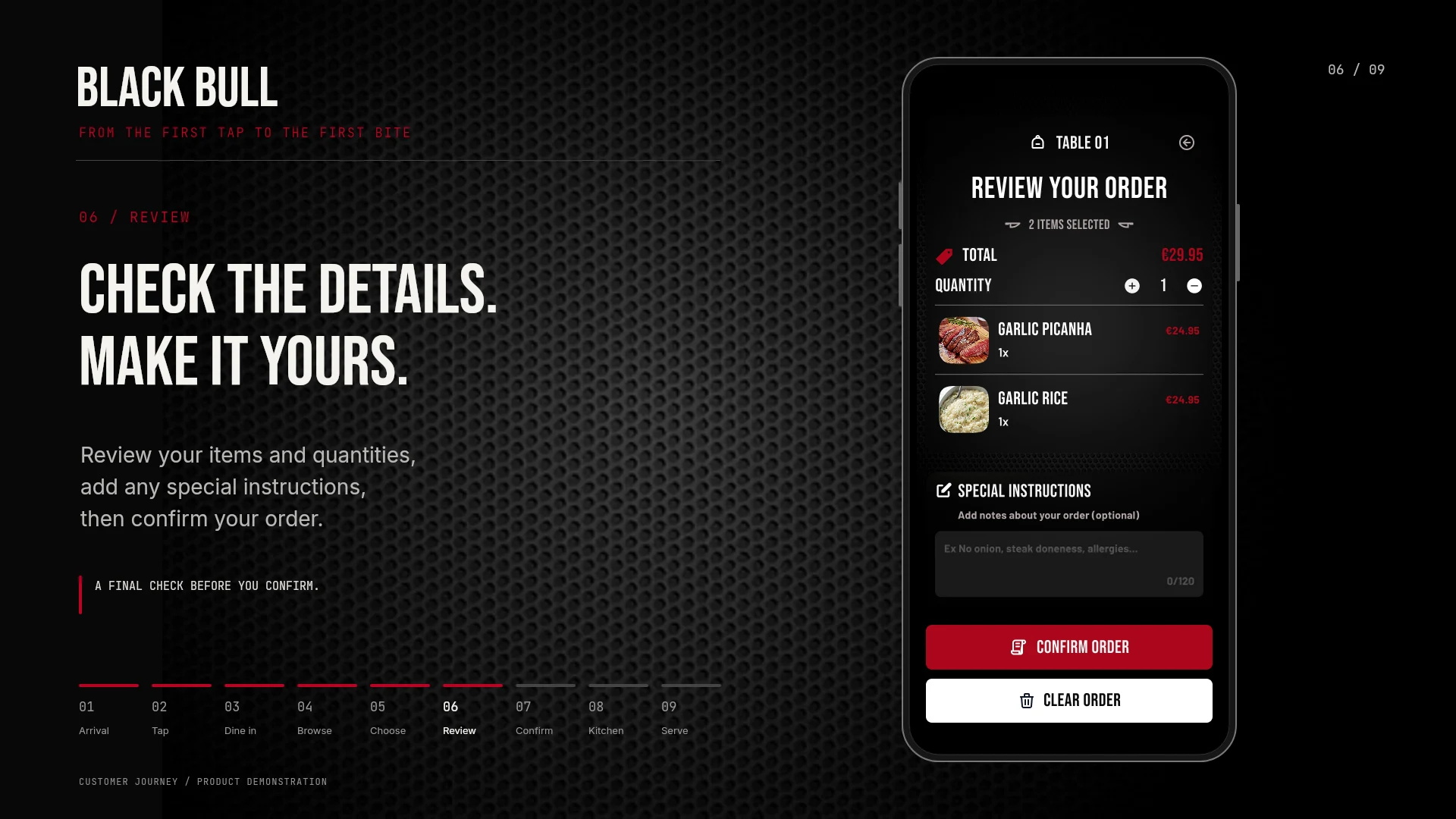
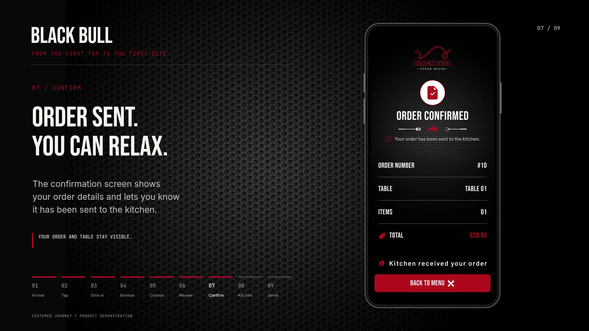
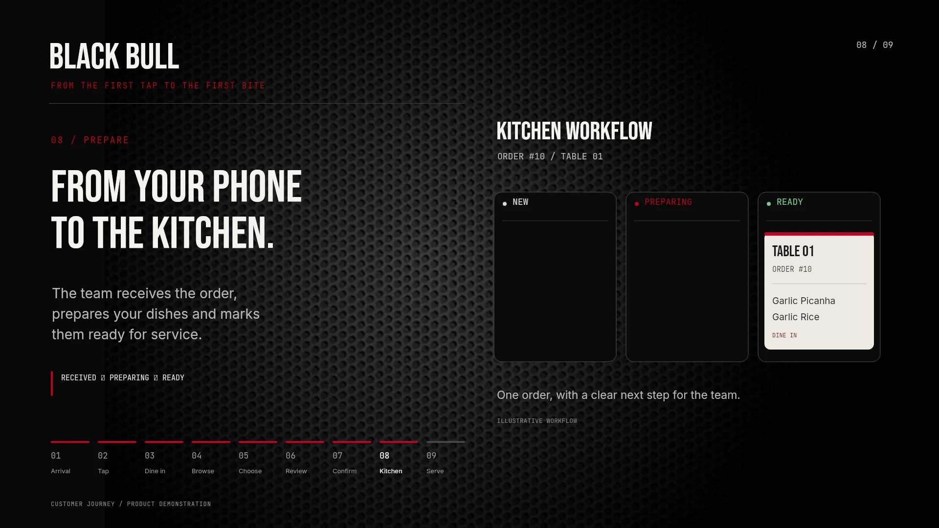
Follow the proposed Black Bull experience in nine steps: arrive at the table, open the menu with an NFC tag, build an order and follow the handoff to the kitchen and table service.

Select an image to open it at full size in a new tab.

Walkthrough images are in English. Kitchen and table-service scenes illustrate the proposed workflow.

03 / VISUAL DESIGN

A bold identity. A familiar way to browse.

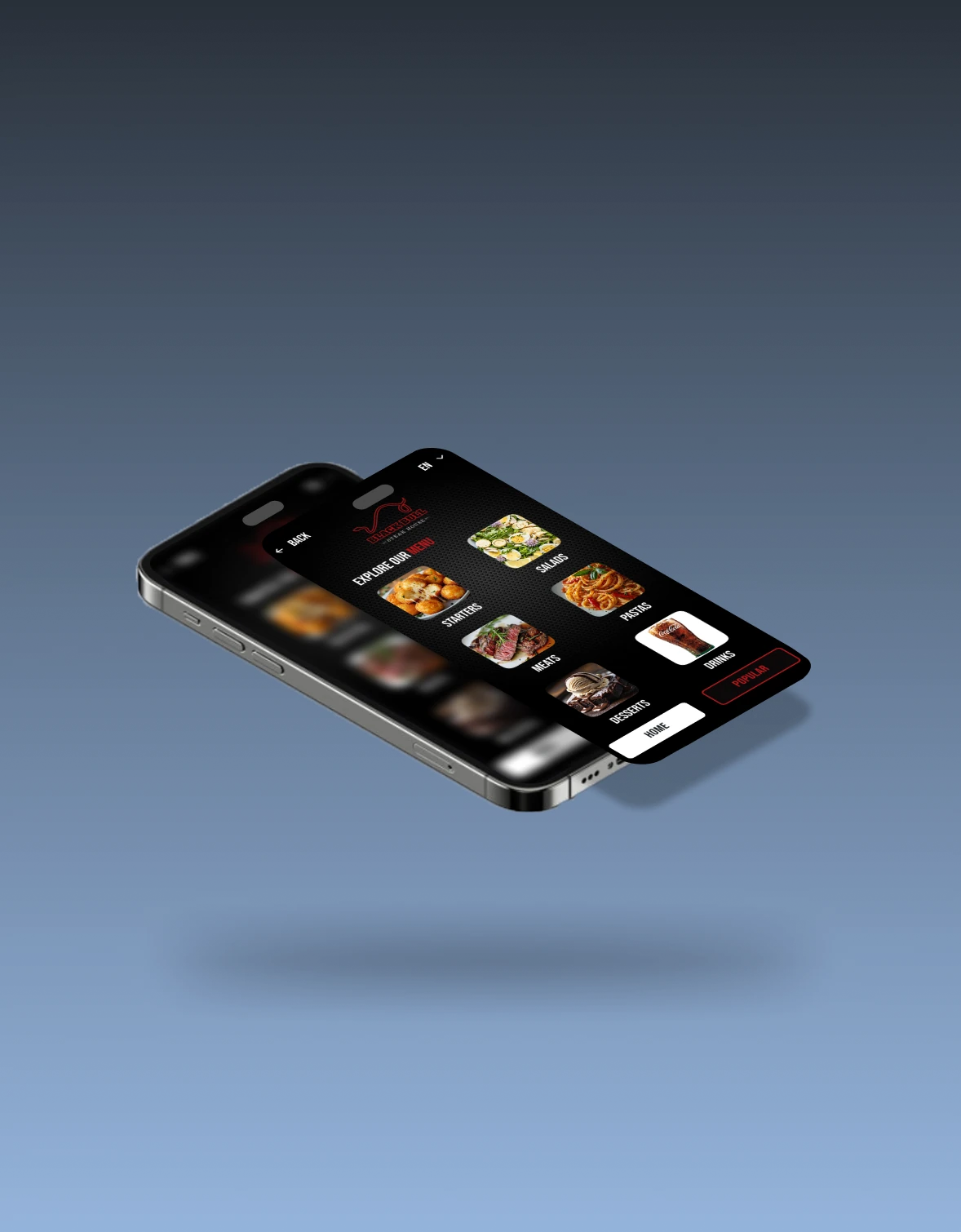
The interface takes its visual direction from the Black Bull brand: a dark backdrop, red accents, condensed headings and prominent food photography. The menu structure stays simple so the visual identity supports the task.

Food before extra navigation

Each category combines an image and a text label, giving guests two ways to recognize where they want to go.

A consistent visual language

The logo, dark surfaces and red actions connect the welcome screen, menu and confirmation.

Clear ways to move around

Back, Home and Popular actions give the menu recognizable navigation points.

Exploded mobile mockup highlighting Black Bull food categories on a blue background
INTERFACE DETAIL / CATEGORY HIERARCHY

04 / ORDER FEEDBACK

Make the next moment feel clear.

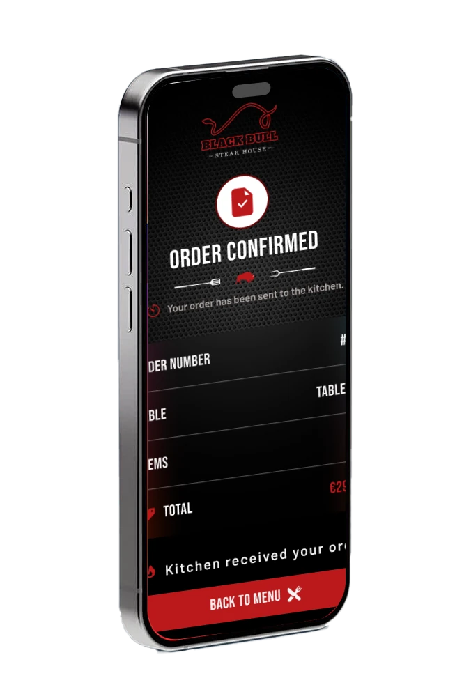
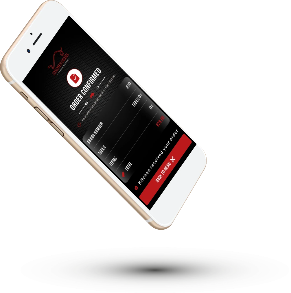
The confirmation screen answers the immediate question: was my order received? A prominent status message is followed by a compact summary and a direct route back to the menu.

Black Bull order confirmation screen on a black smartphone
01 / EXPLICIT ORDER STATUS
Angled white phone showing the confirmed order, table, item count and total
02 / ORDER SUMMARY + RETURN ACTION

05 / THE KITCHEN EXPERIENCE

The other side of the order.

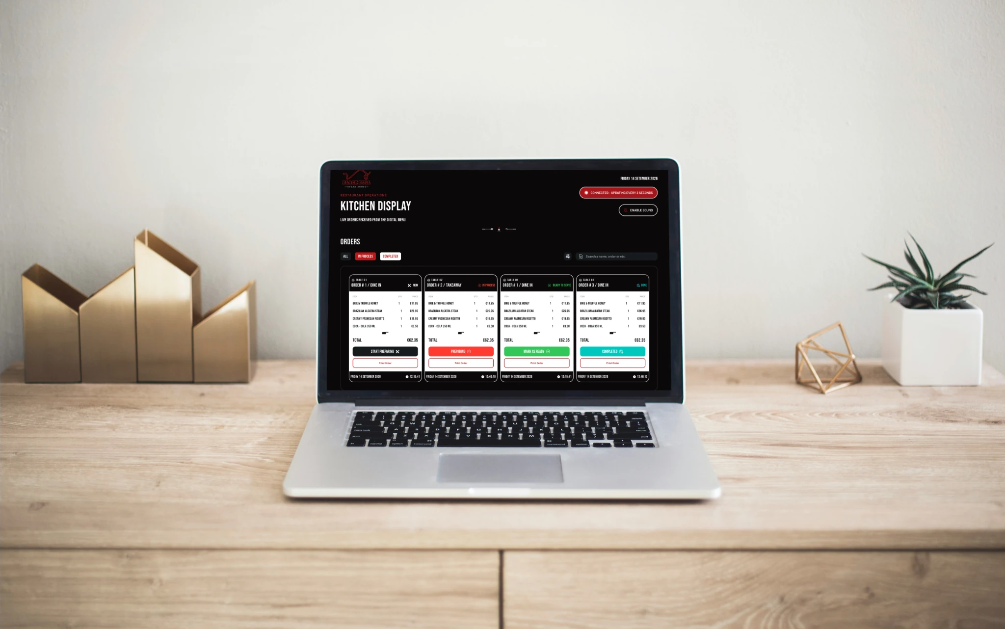
The kitchen display shifts the focus from food discovery to order preparation. Its cards group the table, service type, items, quantities and total, with a visible action for the next preparation stage.

Laptop on a desk showing Black Bull kitchen order cards in different preparation stages
KITCHEN DISPLAY / ORDER CARDS + PREPARATION STATES
  1. New

    Identify the order and start preparation.

  2. Preparing

    Keep work in progress easy to recognize.

  3. Ready to serve

    Show when the order is ready for service.

  4. Completed

    Distinguish finished orders from active work.

Text labels accompany the status colors, so the meaning of each stage is written out as well as visually highlighted.

06 / DESIGN + DEVELOPMENT

Turning the interface into a product.

My role brings product design and front-end development together. The project is an MVP in development; this case study presents the interface direction and intended restaurant workflow.

Product design

Figma supports the screen layouts, visual hierarchy and mockup presentation. The guest and kitchen views share an identity while serving different tasks.

Front-end foundation

Next.js, React, TypeScript and Tailwind form the project stack. The implementation focus is a consistent, responsive interface across the menu and kitchen views.

Next validation steps

Test menu discovery and order clarity with guests and staff. Check keyboard access, contrast, touch targets and the handoff between order submission and kitchen status.

07 / PRODUCT THINKING

Clarity connects the whole experience.

The central design lesson is that the customer journey continues beyond the menu. A clear confirmation helps the guest understand what happened, while a clear kitchen card helps the team decide what to do next. Designing both sides makes the handoff part of the product.

KEEP EXPLORING

More from my portfolio.

Back to top